For no other reason than simplicity, we'll look at each alphabetically.
The Conservatives:

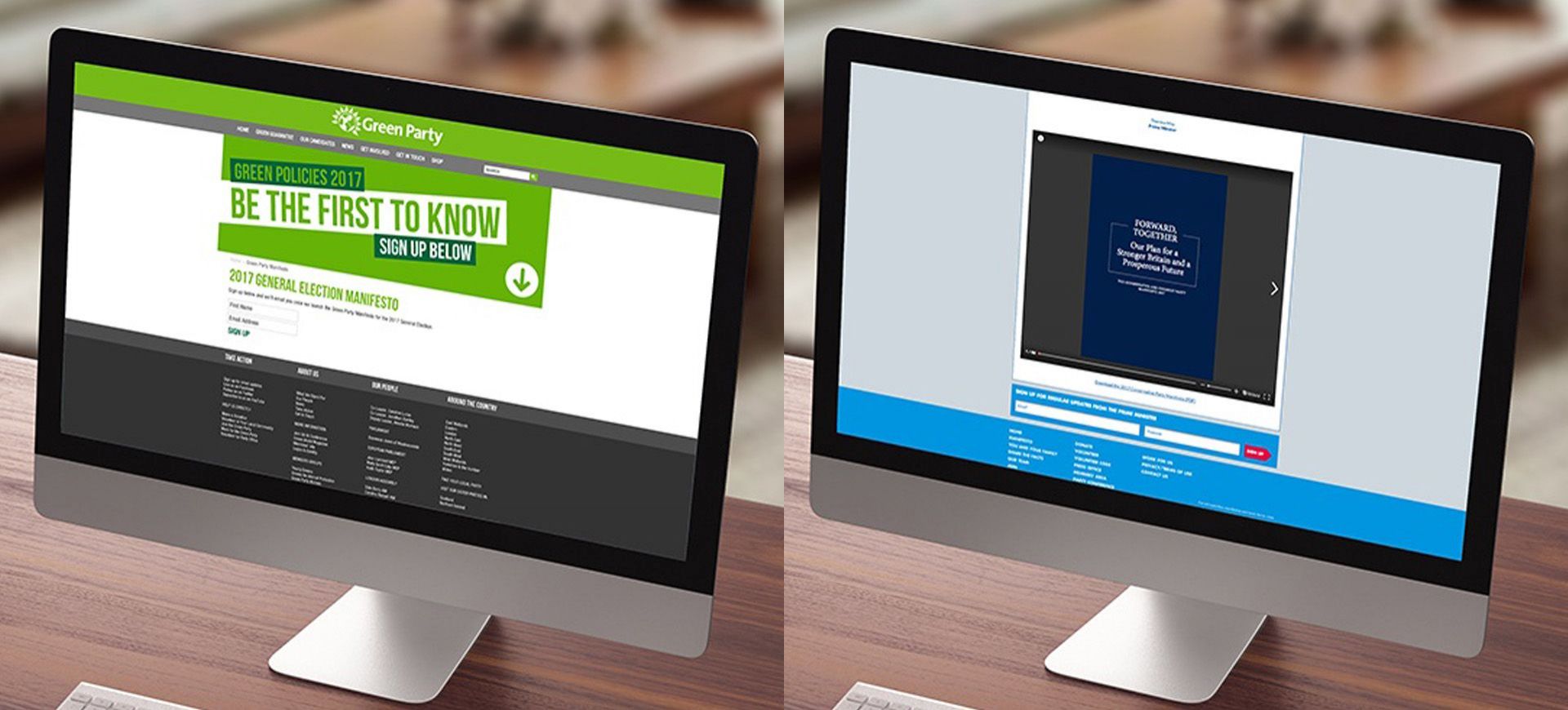
Well, first off, I'm going to say they've been a bit lazy. They've got a nice enough landing page with a short foreword from Theresa May but then they've just created a PDF and inserted an "issuu" document in an iframe.
Let's have a look at the pdf then. On the cover, I noticed three things:
-
No logo
-
The colour used is different to the normal Conservatives branding
-
The font is a serif font which, again, is different to their normal branding
I'm really surprised at how they've done this, I want to be able to go on to the site and find what is most relevant to me but there's no key, no menu and the contents page isn't particularly clear and someone new to politics or not particularly knowledgeable, might find it difficult to navigate. Also, it's almost entirely copy, with only one image across the 88 pages.
Green

What can I say, really nice, modern landing page graphic but you have to sign up to see anything. What's the point?! It instantly puts people off - they should have made it optional.
Labour

Labour have gone with a simple microsite, with a big illustrative "FOR THE MANY NOT THE FEW" graphic on the left and all of their section links (menu system) to the right for easy navigation on a larger screen and just the menu system if you're using a smaller screen.
Also, they have colour coded their sections which makes it nice and easy to navigate the site and they used some nice imagery to represent each section. When you're in the subsections, they've used nice techniques to pull out some quotes over imagery but there's so much copy!
One part I'm not so keen on is the menu when you're on a standard page. Firstly there's no top level navigation and secondly, the menu button pulls out a very standard looking menu (which could use some padding each side) which anchors links to items on the page, rather than giving you the top level navigation.
Good effort though and best so far.
Liberal Democrats

Another microsite, but the first thing you notice is that imagery is obviously from a stock site. There's loads of them, each used to illustrate an area of their manifesto. As much as I'm not keen on the imagery itself, they've used them quite nicely with a simple layout and some nice roll overs. Each section has a well thought out title which really helps guide you in the right direction and I found it easy to get where I wanted.
Each section also has a video of various styles, from interview/testimonial live video to animated shorts that talk about the area of interest which I think is a nice touch.
As you scroll through each section, they've used accordions to section off the content into easy to navigate parts so there's not a massive page of text to scroll through, just easy to read sections you can find easily.
And finally on each page, there's an iconographical call to action section at the bottom for downloads and interestingly, they have a section of policy videos in sign language.
One thing I spotted while I was searching the web for these manifestos is that the Lib Dems had paid for Google advertising for search terms "Labour Manifesto" and "Conservative Manifesto". I think they have stopped this now but it was interesting to see them top with paid advertising for those terms.
UKIP
When I first wrote this blog article, UKIP had a rather unimpressive 16 page downloadable PDF which I reviewed and there wasn't much positive to say about it. Since then, it was pointed out to me by local freelancer Lisa Blann, who designed a much better document, that they had replaced the old manifesto document with her new manifesto.
So let's have a look at this new document.

UKIP's new manifesto is a PDF download or you can view online (through issuu) available from a simple landing page on their website.
This new document is really smartly laid out and nicely branded with the use of an appropriate image of the union flag on the front cover (and throughout highlighting calls to action and quotes) which I think represents UKIP well.
Throughout the document there is a nice use of colour to separate each section or issue, bringing out quotes well and a nice use of real looking imagery throughout.
Overall this is a really great document, however, it is very long (64 pages) and I found it a little tricky to find the information I wanted to find, much like the Conservatives pdf.
In Conclusion
There are two front runners for me design and UX wise, Labour and Liberal Democrats. They are both well laid out, easy to navigate and get to the information that's pertinent to you. But if I had to pick a winner, despite the use of lots of stock imagery, the Liberal Democrats microsite is the one I would pick. Ease of use, smart accordions to separate content and also thinking of everyone, the sign language videos, I thought were a really great idea. And just to reiterate, this does not reflect any form of political view, I don't want to get into trouble!
Back to Blogs