21st Nov 2016

21st Nov 2016
Process colour
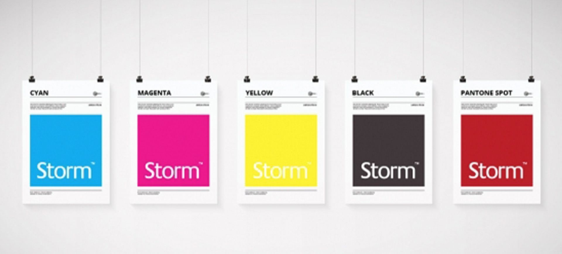
Process colours are created using a combination of dots from four key base colours to print text and images. These are cyan, magenta, yellow and black (CMYK). The mix of every colour is measured using percentages of these four, for example a bright red would be created by mixing 0% cyan, 100% magenta, 100% yellow and 0% black.
Printing your job using on a digital press (digital printer) uses process colours made up of CMYK values which are applied directly. A litho printer (aluminium plates - one for each of the four colours) will also print using process colour for your job, however a litho printer also provides the option to use spot colour printing too.
Spot Colour
Spot colour is also often referred to in the following terms:
Spot colour is created without dots. Spot colours are usually referenced using the Pantone Matching System for printing. Think of it as a colour that has been specially mixed up and used as an ink in its own right (similar to when you go to a DIY store and have a can of paint mixed for you from a standardised colour chart - you know that every time you have that colour mixed it's going to be the same). The benefit of spot colour is that it gives a stronger, cleaner and more pure colour than CMYK. It is the preferred choice when accurate colour reproduction is required for consistency across jobs. It is also better for certain colours that can prove difficult to print using CMYK such as strong, bright orange or gold.
Knowing which colour to use
It is important to know how your project will ultimately be used when you start creating it. Is it to be printed or viewed online? If you're printing, are you setting it up to use process colour, spot colours or maybe a mixture of both for example four colour plus one spot?
One of the most common things when creating a job is that you will be provided a Pantone colour to use for a logo or brand, for example Pantone 485, yet you might be printing using process colour. Therefore, you'll need to know the CMYK percentage splits that are used to match a process colour to Pantone 485.
You can use your software swatches to convert this (eg.Illustrator, Photoshop, InDesign), but the more accurate way is to use a Pantone swatch for consistent values. One of the most useful is the Pantone Color Bridge. Not only does this show you the Pantone colour reference, but alongside each it gives the recommended CMYK percentage split. It also shows a conversion to RGB splits and to Hex colour too which is extremely handy when you are working on both print and online projects simultaneously.