11th Mar 2020

11th Mar 2020
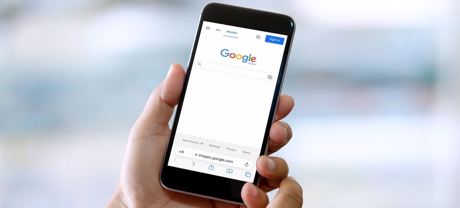
This all started back in November 2016, when Google first realised that an increasing percentage of people were searching for information on their mobile phones, rather than their desktops. By experimenting with making their index mobile-first, they recognised the importance of making search results more beneficial, not only for those on their desktop, but for mobile users too.
However, this doesn't mean desktop users are going to be left behind. Like the name states, mobile-first, not mobile-only. So if you're against optimising because Google says you should or don't fancy being mobile-friendly, you won't be completely excluded from the list - your website will just be ranked lower.
It all ties in with the newest trend in web design and development that says we should be focusing on the mobile version first, and the desktop site second. Having a responsive design is an absolute must. Now is the time to not fall behind - it can have detrimental effects on where you appear in search results.
Plus, in terms of making sure that your website is best suited for mobile-first indexing, you need to make sure that the following are ticked off your to-do list:
Googlebot can access and render your website's content - make sure you have the same meta robot tags and, above all, don't 'lazy load'.
Your content correlates between the mobile and desktop version of your site.
Make sure both have the same structured data (the same goes for the metadata) - if your website uses Data Highlighter, ensure it's on your mobile site too.
Figure out the placement of your ads - i.e. if they are at the top of your page, it's going to take up too much room on your mobile site.
Your images are the best they can be - you need high quality images, matching URLs and the same alt text for both versions of your website.
Your videos are also the best they can be - same URLs, same video structured data, and make sure the placement of the video fits with the design of your mobile site.
The main takeaway is that your content must match and your URLs must correspond between the mobile and desktop versions. Google warns that if the URLs are different, you'll probably experience traffic loss while changing over to mobile-first indexing.
To be quite frank, there's not too much to worry about here. Google recently announced that at least 70% of all websites have already implemented the new indexing method. As long as a website is mobile responsive and the content correlates with the desktop version, nothing will really change. So your website is probably already optimised, without you realising it. And if you're thinking of creating a new website any time soon, Google will automatically implement mobile-first indexing for your site.
It just goes to show where the future of websites is going. And mobile-first indexing is the next step.