What actually changed
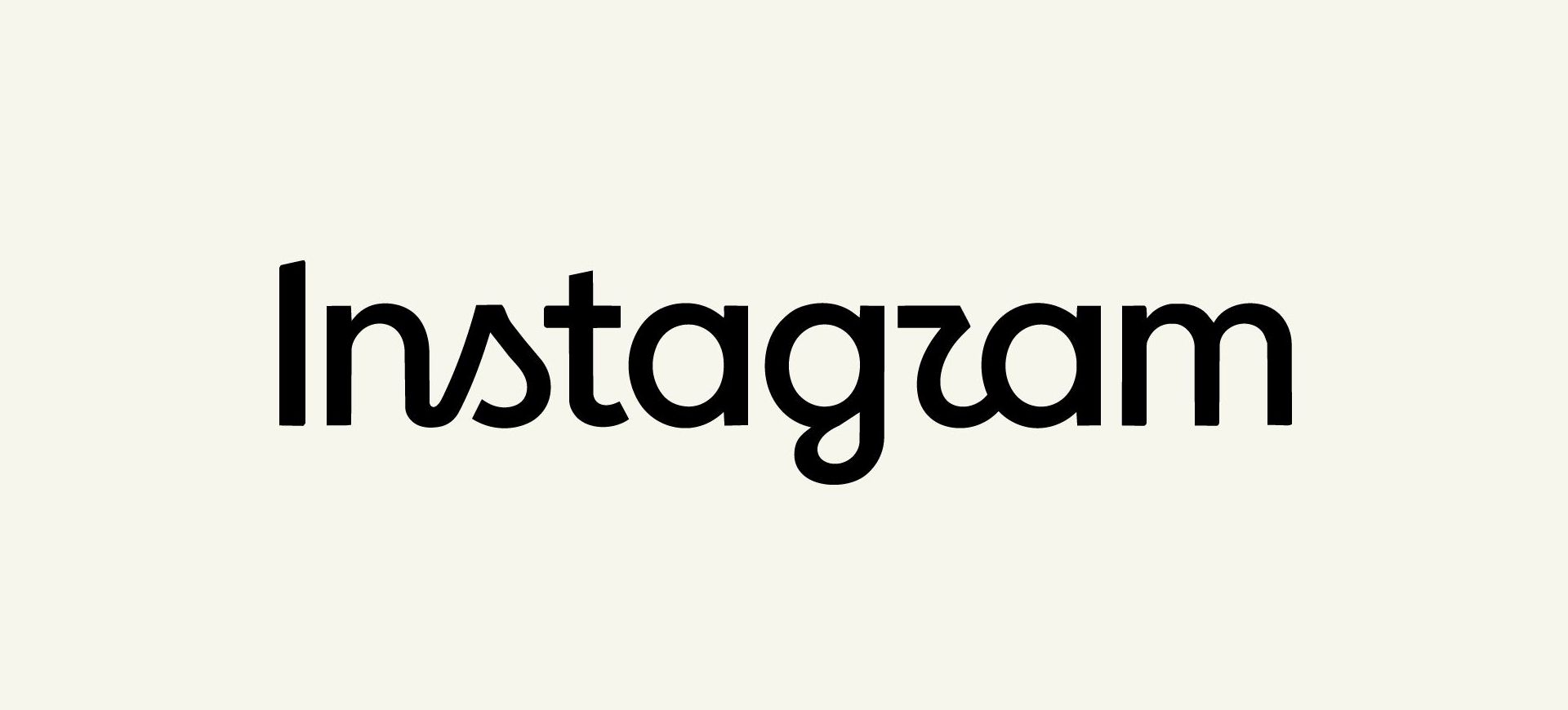
The camera icon is untouched. This was purely an update to the logotype. The new typeface features bolder, more compact, rounder letterforms. The gradient is getting used more sparingly across the brand system going forward. Alongside it they've rolled out two companion typefaces, a handwritten one and a monospace one, so this isn't a one-off tweak, it's a proper system update.
No agency credited for this work. Looks like it came from Instagram's in-house design team, led by their design director Jasmine Probst.
"Instagzam?"
The new “r” sits close enough to a z that people immediately started reading the logo wrongly. Genuinely funny, and it's now attached to the brand harder than any press release could manage. Here's the bit worth sitting with though. That kind of joke only works because Instagram is already secure. Nobody stops using the app because the r looks weird.
A brand with that much equity can afford a bit of ambiguity, it gets read as character. A brand three years old cannot afford the same joke, ambiguity there just reads as a mistake. Worth remembering the next time a client gets nervous about a bold typographic choice and asks for something "safer." Confidence and legibility aren't always the same design decision, and knowing which one your client's brand can actually successfully utilise is most of the job.
Everyone's hating the "R"
Every take in the past few days has landed on the same joke, “the R looks like a Z, haha!”
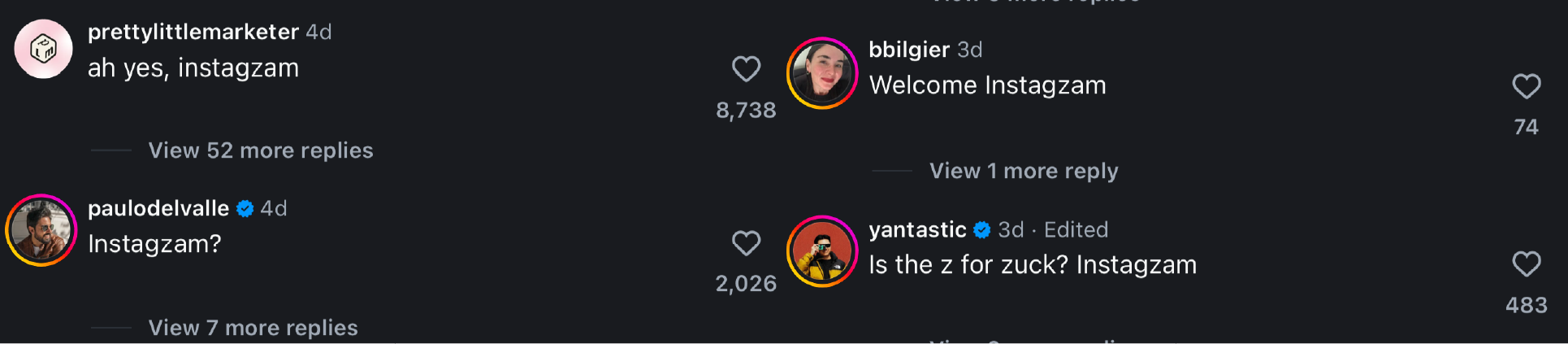
Instagzam. Fine. But that's the surface reaction and it's missing the actual story, which is why did the wordmark and the brandmark stop matching in the first place.
Go back to 2022. The app icon got its last proper evolution then, the gradient camera got refined and tightened up. And ever since, you basically never saw the brandmark and the wordmark sat together properly aligned as one system. They'd drifted. Which is an odd position for a brand that size to sit in for four years, icon says one thing, logotype says another, and nobody outside the industry probably even clocked it.
So why leave that gap for four years and then only fix half of it now? A few reasons, and they're good ones.
The icon and the wordmark aren't doing the same job. The camera icon gets recognised globally at a glance, even shrunk down to a thumbnail on a home screen where the text would be unreadable anyway. That icon carries all the weight. The wordmark sits quietly in app headers and marketing, it's doing far less navigational work day to day.
The two elements were also never driven by the same problem. 2016 was about killing off the old retro skeuomorphic camera because the product had outgrown it, that was a functional shift. This update is purely typographic, tightening up a decade old script into something that actually holds up against modern UI. Different job, different timeline, no reason they'd need to move together. And changing everything in one go is just risky. You get one round of backlash instead of two manageable ones. Doing it in phases lets a brand that size modernise quietly instead of setting off a full identity crisis in one afternoon.
Worth a mention too, off the back of this, that Instagram have never really owned a colour the way Facebook owns blue or Snapchat owns yellow. The gradient was always a bit of a mess to trademark and defend. Committing harder to it as the actual ownable asset, rather than the wordmark or a single flat colour, is the braver call in all of this. Secondary story to the wordmark change, but it's the one with more long term value attached.
Hiding in plain sight
Look closer at the wordmark and there's another detail sat right in the middle of it. The middle section almost sits alone, rather than joining the rest of the letters, it's an intended break of cursive for a brilliant cause (at least in my eyes.)
Ins tag ram. Tag. Right in the centre of the logo.
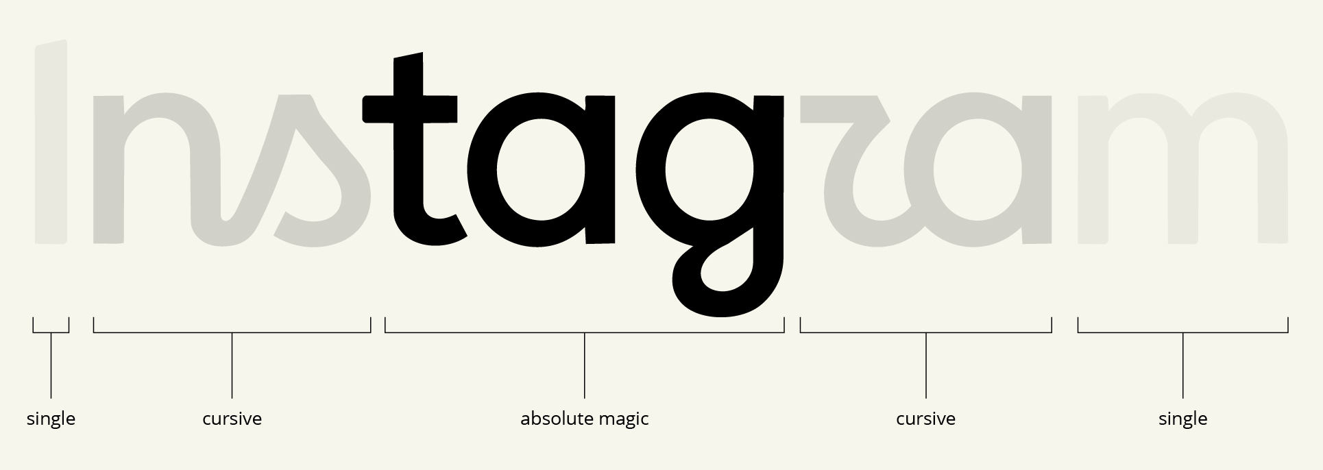
Tagging is one of the platform's core features, it's baked into posts, stories, reels, comments, basically everywhere. Whether that's a deliberate bit of wordplay from the design team or a genuinely happy accident of the letterforms lining up, it's a clever detail either way. The kind of thing nobody clocks on day one and then can't unsee once it's pointed out.
Brands are engaging, and that's the real win
Scroll Instagram right now and half the brands on there are doing their own version of the joke. Posting it in the new font, doing the "how do you even say this" bit, getting involved for free. And that's the clever part nobody's giving Instagram credit for.
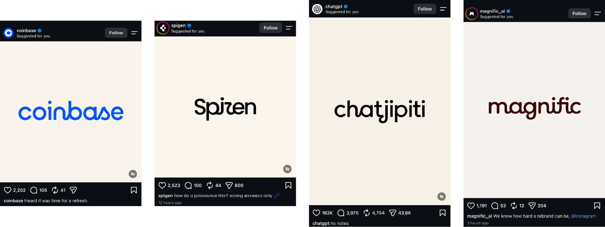
The rebrand has driven engagement on Instagram's own platform, through brands mocking Instagram on Instagram. That's not a side effect, that's the outcome you'd design for if you were smart about it. You don't need a campaign when the logo change is the campaign. Every brand jumping on the joke is doing Instagram's marketing for them, for nothing, because it's an easy laugh and easy engagement for their own page too.
Whether that was intentional or just a happy accident of shipping a slightly ambiguous r, doesn't really matter. The result is the same. Controversy, free content, and weeks of chatter for a font update.
The part that matters most
The interesting move isn't the letterforms, it's the restraint. They didn't touch the icon. They didn't touch the gradient system wholesale, just dialled back how often it shows up. Ten years of brand equity in that camera mark and they left it alone.
That's the discipline most rebrands miss. Clients want to change everything because everything feels tired to them, they've been staring at it too long. The actual job is working out what's earned the right to stay.
I think Instagram just pulled off a masterclass in evolving a brand identity, whilst leaving the rest of the house standing.
- share
-

-

Back to Blogs