Colour
Everything will be more colourful in 2019. If Shutterstock's colours of the year are anything to go by, it's going to be eyeball-burningly bright.
For the past couple of years, there's been a misconception that minimalism is purely for a black and white palette (or other more muted colours). You could say that a very popular tech company named after a piece of fruit has dominated (and almost dictated) the minimalist trend for the past decade. Now, everyone's breaking away from the traditional minimalist style and incorporating a bit of colour. It still remains sleek and clean but it's now more interesting to look at.
Reflecting Pantone's colour of the year ('Living Coral' in case you didn't know), palettes will be soft and dreamy, while still making a psychedelic impact. This year's colours looks remarkably similar to our brand colours *smug face* - guess you could say that we're trendsetters.

Left to right - David Glissmann; Futura; Design Army; Anna Jay
Chaos
2018 dipped its toe into chaos, but 2019 is diving straight in. Whether it's the typography or the style of an advert, designers will be throwing caution to the wind this year. It's almost become the new movement in the design world.
While it might not be for everyone, you can't deny that it's a bold statement that will grab attention.
The glitch effect from last year has transitioned from still images into animation for websites. Bringing the trend to life makes it more effective than last year, as the audience can get the full impact the effect brings, creating a bit of intrigue and mystery. It can be pretty jarring as well, but that's chaos for you.
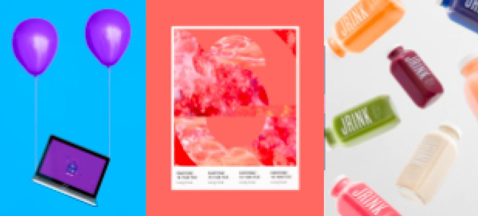
The anti-gravity trend (I think) ties quite nicely into the chaos movement. I mean, throwing your products into the air in order to take a more interesting shot is not exactly safe. It makes for a more interesting image, rather than a simple flat lay. It's intriguing and creates that futuristic feel that people are after this year.

Clockwise from top left - Brandon Archibald, Pose Kadu, Boris Alexandrov & Anna Alexandrava; Elsa Rodrigues; Standardabweichung; Touch Agency & Charlie Jennings; Foxtrot Studios; Ben Fearnley
Typography
Typography is definitely set to make an impact this year. It's getting bigger, bolder and more diverse.
Over the years in modern design, sans-serifs have reigned as go-to fonts. This year however, serifs are making a comeback. Designers are now seeing sans-serifs as more impersonal and - to be dramatic - soulless. Using a serif will add a bit of character and charm to your campaign, advert, direct mail or website.
Outline typography looks most effective when overlaying an image or product that you want to show off, but don't want the typography to be the main focal point. It can lose its impact when against a plain background. It also looks really good when it's animated on a website.

Left to right - UnderConsideration; Chad Mann; Levi Lowell
Throwback
As with every year, there's always a call back to the past. Even though everything else seems futuristic, the Roaring Twenties are here. Art Deco designs will be popping up throughout this year, and are not strictly limited to packaging (unlike last year). Logos with this design add that je ne sais quoi to brands and companies looking for something so classy that even Gatsby would be jealous.
There's something so cool about mid-century design and you're going to see more of it this year. You'll mostly find it in web design this year; the mid-century influence will dominate the overall style of the website, with quirky illustrations reminiscent of the era's advertising, but with a 2019 colour palette.
And now to the '70s. It's influencing typography, graphics and colours all the way down to the saturation in photos. The 1970s trend is a complete rejection of last year's over-the-top, in-your-face clashing of the 1980s / 90s; it's more relaxed and easy-going. The iconic patterns, prints and colour schemes are a welcome break from the other futuristic and vivid trends of 2019, so why not recycle these classic designs?

Clockwise from top left - Gabby Lord; votesaveamerica.com; Nicola Broderick; Skilline; Idle Letters; Brandon Nickerson
Illustrations
Devil's in the detail this year.
Illustrators are being given free reign and everyone is after unique artwork for their company / brand / website / packaging. Although often digitised, everything from brush strokes to the bubbles left behind from paint are still visible, making your advert or product (or whatever you fancy) super realistic and authentic. It's these little details that everyone will appreciate.
Following on from the hand drawn illustrations trend, alternative art will make a mark this year. Fun doodles and freestyle drawings will dominate packaging in 2019, and look great when paired with other trends. It's pretty versatile and the designer can easily run wild with it.

Clockwise from top left - mumba studio; Estudio Pum; Daryl Feril; József G Kiss, Classmate Studio, Lili Köves, Attila Ácas & Fruzsina Fölföldi; secondcityworks.com
And the trends that are staying put
You'll see the big ones from last year getting a bit of an improvement from when you last saw them, each transitioning quite nicely to fit the new aesthetic of 2019.
Gradients and duotones will get an upgrade this year. As well as a refinement to the technique and the addition of bolder colours, gradients are being used for more than just backgrounds. Duotones are being used in conjunction with gradients, working in perfect harmony to create something fresh for 2019. Thanks to Spotify, gradients and duotones are no longer just a trend; they've become a permanent aspect of design.
Vintage designs and metallic effects are just as big as they were last year. Vintage designs will still be used for packaging, as there is nothing else that compares when you want create something beautifully intricate. And, of course, the metallic effect will often be incorporated with it, since the two trends are a match made in design heaven. But that's not to say you can't use this trend as a stand-alone aspect of design. In the futuristic style of 2019, what ties in better than the metallic effect?
Of course, the 3D effect and isometric designs will remain for 2019. You'll see them mainly used for typography and web design, filling the whole webpage as if it were a portal to another realm that you could step into. They make for a more interesting design, stepping away from flat imagery and creating a whole new experience for an audience. There's so much you can do with isometric drawing and 3D, as it gives designers a bit of creative freedom to explore the presentation of products, shapes and letters. These two trends aren't going anywhere just yet.

Clockwise from top left - Happycentro Design Studio; Cristian Malagón Garcia & Núria Madrid; Santi Zoraidez; Ben Fearnley; Bruno Pego; tq.com
The future is the overarching theme of 2019. The colours, the chaos, the artwork. It's all a little brighter than previous years. It's clearly starting to break away from the dictated design path of previous years, going against the grain.
It makes us all here at Storm12 very excited to see what is to come in the design world.
Have we missed something or have you got a hot tip for what this year has in store? Don't be shy, stick your neck out and let us know.
- share
-

-

Back to Blogs