3rd Sep 2018

3rd Sep 2018
When talking about design, you can't avoid typography. And 2018 has shown that typography has been reimagined into something new. You'll find these styles of typography more in the media, as they reflect the creative aspect of that industry. If you look hard enough, they're on every poster, album and book cover.
Negative space
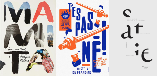
Negative space typography in particular has grown this year, and it's clear to see why; through partially hiding an image within the font, you can create a bit of mystery with the message you want to present. Using this style, you can provide snapshots and tell a story with the images chosen. Look at the example; the typography can give us a clue as to what the book is about, without giving too much away. If mystery is the goal for your design, then the hidden element of negative space typography will entice your audience in.
Cropped
Another example that reappears every so often, and this year is no exception is cropped typography. It is one of the more interesting of the bunch, but it can be a difficult one to master - if your font choice is off, it can be barely legible. Cropping off a bit too much gives the same outcome. This style of typography is not as limited as the others in terms of the different effects you can produce with it. You can create the sought after 3D effect by using other elements within the design to 'hide' parts of the font, rather than entirely cropping them, resulting in a 'multilayered', 3D effect.
Chaotic
Two types of typography that go hand-in-hand with each other are cropped and chaotic. It doesn't follow the usual linear pattern, but rather scatters about the page. And just like cropped, chaotic typography can go horribly wrong if the wrong font is used; probably best to stick to a simple, bold font, as opposed to calligraphy, so your audience have the best chance to deduce what it says. Also, make the order of letters a little too unconventional and it becomes too complicated and, in truth, a waste of time.
While it can be used to great effect, the only real downside with using cropped and chaotic typography in particular, is that it is only as good as the overall design you create. People have to be engaged in order to read it; if it's not interesting enough to grab attention, then quite frankly, no one will be bothered to decipher what it says. Sorry.

New design effects have appeared this year; many follow the pattern of distorting an image or making it something new, while others add that details that make them. Each effect brings something different to each image, animation, video or text it is applied to, creating and conveying a distinct message for whatever your campaign may be.
Gradients
Gone are the days of PowerPoint's not-very-well-blended gradient as the go-to background for any respectable presentation - the gradient is back. Just like the 80s and 90s styles. It's been upgraded and made much more 2018. The introduction of dual tones, added textures and more vibrant colours has dragged this effect from the past to the present. Social media platforms, such as Instagram, have adopted gradient for their logos, while Apple's wallpapers for their iPhones and iPads show the realistic ripple effect it can create when made interactive. You can easily create this depth with your chosen gradient, even when stationary. Giving it shadows will produce an almost 3D effect, another key design trend that keeps cropping up this year. And, turns out we were ahead of the pack with this one, with the introduction of our new logo last year. *Smug face*
Glitches
Now making its way into design, the glitch effect represent the more modern stance within design this year; with more emphasis on AR and the digital and technical side of creating, you can see why this effect is so popular. While always remaining to be a staple in the horror genre, using glitch for images was previously seen as pretty undesirable for general design, often seen as a mistake or a corrupted file. Now in 2018, the more distorted the better, and the glitch effect fits the bill.
Metallic
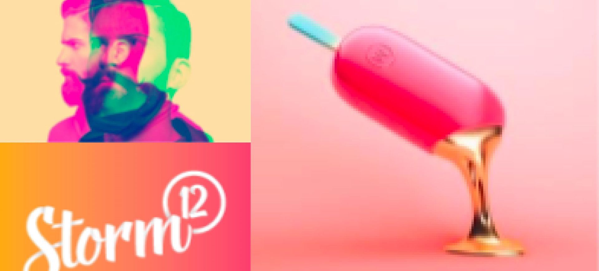
Definitely the classier of all these effects; adding metallic elements to your design injects a bit of luxury and texture. And when presented in its liquid state, its fluidity can add a realistic element to flat imagery. Using the example, the 'shine' or reflective aspect of the metallic effect makes it look as if it was actually spilling out. You can always tie it in with the other popular 2018 trend of vintage patterns, as the intricate period design with metallic finishes can make for some beautiful packaging. It's not commonly used on everyday items; because of its connotations with precious metals, it'll normally be applied to ceremonies or more up-market advertisements and products. For example, we've seen it used to highlight the anniversaries of prestigious events, such as Cannes Film Festival's 70th last year.
Double exposure and duotone
Inspired by Spotify and their playlist images, many designers are using double exposure and duotone to get themselves a more interesting image. It follows a similar pattern to a couple of other effects that are popular this year, since it warps the original design and transforms it into something entirely different. By overlapping the design and different colours, you can give a nostalgic feel to the image if done correctly. If you use red and blue for example, as your duotone and slightly shifting the overlay image, you've made a throwback to the 80s and 90s with the classic red and blue 3D glasses. Using effects like duotone, double exposure and glitch can look pretty 'trippy'. Chaos and distortion seem to be the big thing this year, so apply any of those three effects to your campaign and you'll find yourself bang on trend.
Illustration
Probably my favourite of the design effects popular this year is illustrating over images which can transform an otherwise boring picture into something a little more fun. It gives the ability to add little finishing touches and elements you cannot physically bring into the photo when taking it. It's arguably the most creative of the effects, allowing the designer to go wild and doodle whatever they please over the initial design. This technique is pretty reminiscent of childlike drawings; it looks and feels like when we used to scribble in school textbooks. Illustrating over the artwork can give that necessary amusement needed for a campaign and liven up mundane, everyday images.

Rather than continuously creating new ideas, sometimes the best inspiration can be found in the past. Much like every year, 2018 has featured some sort of throwback to decades past. Similar to 2017, the 80s and 90s are still as popular as ever, while the vintage designs of the Victorian and Edwardian period have risen in popularity through the years, reaching their peak this year.
Vintage
While it doesn't necessarily fit with every design brief, the vintage look for 2018 has brought a touch of sophistication into the mix. It has the ability to make any brand look more established and can make a tin of baked beans look classy. The design itself is often extremely detailed and very intricate, making it look as though more effort has gone into it. Back in the day, the designs were frequently created by hand, as opposed to the computers and tablets of today (obviously). You can mimic this and create your own 'hand-crafted' design, making your poster or item that little more special. Vintage design seems to be more drawn to the food and drink industry than anything else, but that doesn't mean to say that not other products are strictly prohibited from using it. If any campaign or product wants to bring back the simpler times of the past, then this is for them.
The 80s
Whether it be on your screens or in your wardrobe, the 80s and 90s are still here. And now it's hit the design world. It's not just bold and neon colours, you've also got the geometric shapes and patterns to play with; this striking trend is probably the most fun to mess about with when creating. While visually making an impact, create that nostalgic feel of people's childhoods, especially since the kids of the 80s and 90s are the ones now buying into campaigns. As minimalism has been the front runner in design for the past couple of years, it's quite nice to see bold, clashing and ostentatious patterns creeping into the limelight. You could argue that the 80s was the boldest of all the decades (the colour-clashing alone) in the twentieth century. What better inspiration for attention-grabbing design?

In this day and age, what with all the technological advances, it would be hard not to expect some aspect of it to be brought into the design world. With 2018 bringing so many new technological advances, the options are limitless for what you can do with advertising or indeed general campaigns.
3D
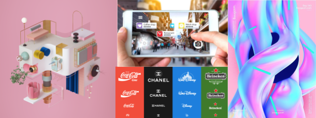
The time for flat imagery is over. 3D is back. And it's no longer restricted to just our screens; designers have been exploring the new ways in which to incorporate 3D into their campaigns this year. With the growing trend of AR, and even VR, people want to be immersed more in what is being advertised to them and flat imagery just doesn't cut it any more. Whilst 3D imagery or its effect seems to have always been popular, it seems almost expected in the modern world we live in - so, that's why it's been a big buzzword forthis year.
3D in advertisements (video or poster) can give the illusion of immersion without needing the glasses. Much like many of the trends in 2018, 3D brings texture - pretty difficult to do that with a flat image.
In terms of animation, 'organic forms' seems to be the big thing for 3D; fluidity is key and the more realistic the better. Blurring the lines between what is on your screen and what is real, giving shapes motion and forms. Campaigns from Nike showcase this, with their trainers' movements becoming fluid and liquid-like. While its flexibility can make some feel a little uneasy, you can't deny it's a bold and attention-grabbing way of transforming everyday objects and combining it with the growing 3D technology of 2018.
Isometric drawing
Isometric drawing has soared this year. Originally (and still) used by the technical industries, such as engineering, it wasn't long until designers realised they could create the illusion of 3D using this technique. You'll find that many designers add a few small details into their isometric designs, making it a little more than a technical drawing. Anything to get away from flat imagery, aye?
Responsive
Adaptation is key to responsive logos; it can 'intelligently' alter the logo's shape, colour or wording, depending on the chosen format's size. Plus, from a design point of view, you can have a bit of fun reimagining a logo to fit the different sizes needed. Responsive logos seem to be going with the times, as you'll find them used more for mobile phones which are more popular than ever. Companies and brands used to redesign their logos to be sleeker and simpler for all the different mediums, but one of 2018's biggest trends has seen that change. Now, responsive logos signal an easier path for brands to take, and meets modern expectations and its technological advancements. That isn't to say all companies need responsive logos. Brands that already have a simple and basic shape, such as a square, don't need to completely alter them when it can easily shrink and still be recognised.
AR
Augmented reality (AR) is no longer restricted to games, videos and apps. Its introduction into the design space has (literally) created a whole new world of possibilities for a designer. The added elements it give provides an unlimited amount of opportunities to really develop a campaign and bring a little more amusement to the intended audience. AR is a mix between the real and virtual world; a user caninteract with both, but can easily distinguish between the two and doesn't need a headset, unlike its sister, virtual reality (VR). You can dip your toe into the virtual world, but just enough that your audience won't be consumed by it, like VR, and take the message away from your design. Pokémon Go best exemplifies AR's success, with the global phenomenon it launched following its introduction in 2016, and ARhas been getting bigger and better ever since.

So, what have we learnt? Previous years were quite minimalistic (looking at you 2016 and 2017), but 2018 seems bigger, brighter, bolder, better. While many designs before looked quite clean cut and precise, everything is a little messier this year. Look at the glitch effect, chaotic typography and fluid 3D animation. Looks like imperfection is in.
A lot of these trends seem to stem from the past - they update the previously thought loud, clashing, over-bearing effects/print/general style into the modern world, and nobody appears to mind. Many have developed over time, like responsive logos and AR, but 2018 really showcased what they can finally do. The overall diversity of all the trends highlights how we're all getting a little more creative every year.
Who knows what 2019 has in store.