Pantone Studio Colour Systems

12th Sep 2016

Pantone Studio Colour Systems

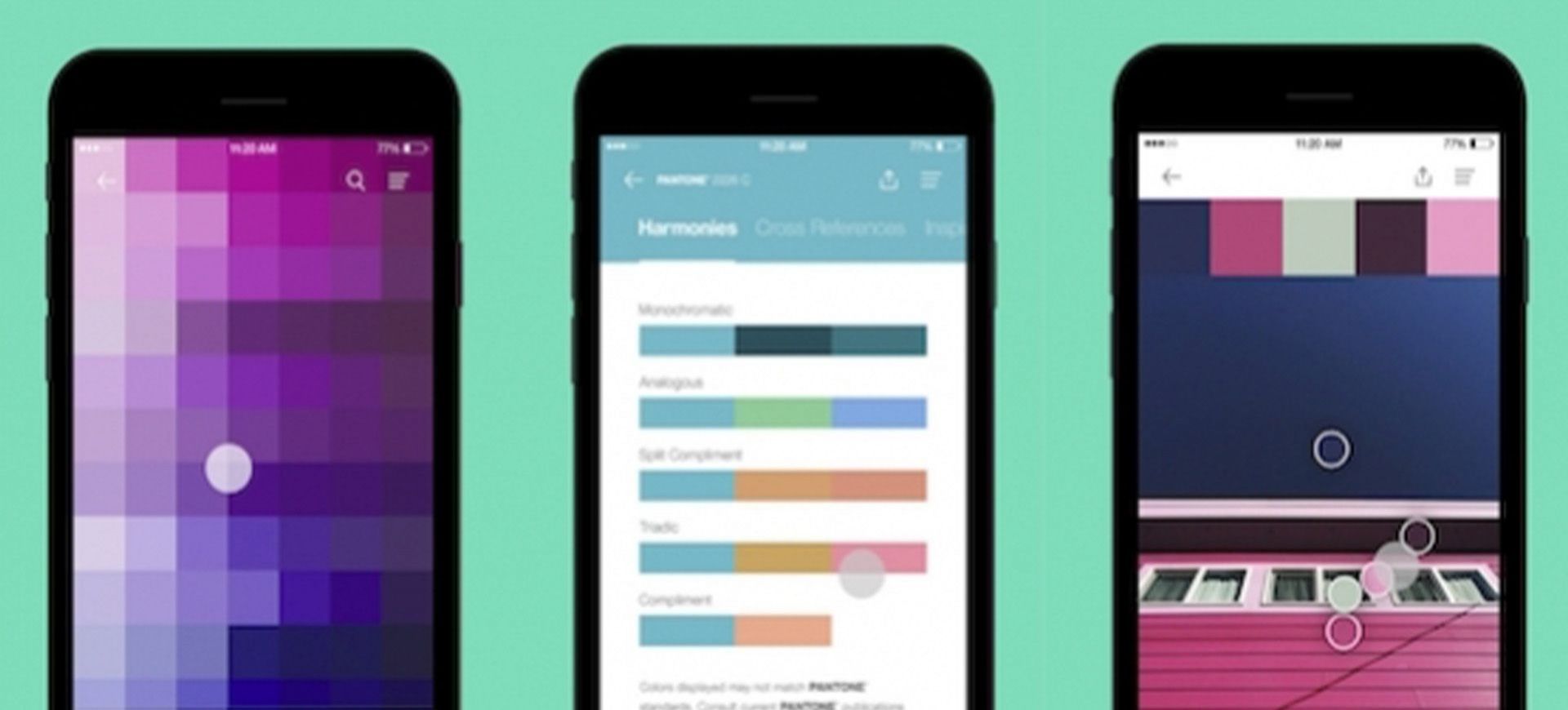
You've heard of Pantone, the authority on colour and colour systems across multiple industries, design included. Pantone has become a byword for communicating colour. Many brands have their own unique colour identity - some have even patented them. The ability of modern printers and manufacturers to match Pantone colour tones exactly changed the creative game.

When discussing creative, you might have brought out the Pantone Bridge - the designers' bible with myriad colours, subtle variances, colours you didn't know existed.

Now they've gone digital.


We were excited when Pantone Studio launched in early August and with an update on 8th September, it's now even better.


The app allows you to explore a world of colour and once you've found a tone you like, it helps you to match harmonious tones and shows you the colour values to replicate in your design. If that wasn't enough - this is the really cool part - you can pull colour values from photographs. Open the app, snap a photo and the system shows you the Pantone colour matches within your image. Smart stuff.


Download it. We love it and you will too.


Back to Blogs

Let's get started!

Get in touch