17th Oct 2016
The Current Logo Trend
You might have noticed recently that a number of well known, household brands have updated their logos, making them appear more simple or stylised.
17th Oct 2016
Many of the original logos were designed using a concept called skeuomorphism - where items are created to resemble their real-world counterparts. Adding depth, detail and definition to graphic elements to make them seem more real and vivid is not a new idea. Brands have been designing their marks to appear three-dimensional and tangible for a long time.
However, now the trend has shifted in the opposite direction. As we become increasing reliant upon, and connected to digital screens, designers have had to embrace the two-dimensional nature of a screen and adapt.
You can see this in many big name brands and thought "Well that new logo is nice, much simpler" but not considered that the reason why is because you were probably looking at the logo on your phone, tablet, computer or smart tech. With websites and apps on the rise, it's no surprise that logos have had to move with the times. Google, Netflix, airbnb and Windows have all jumped on the 2D logo bandwagon, and others are sure to follow.
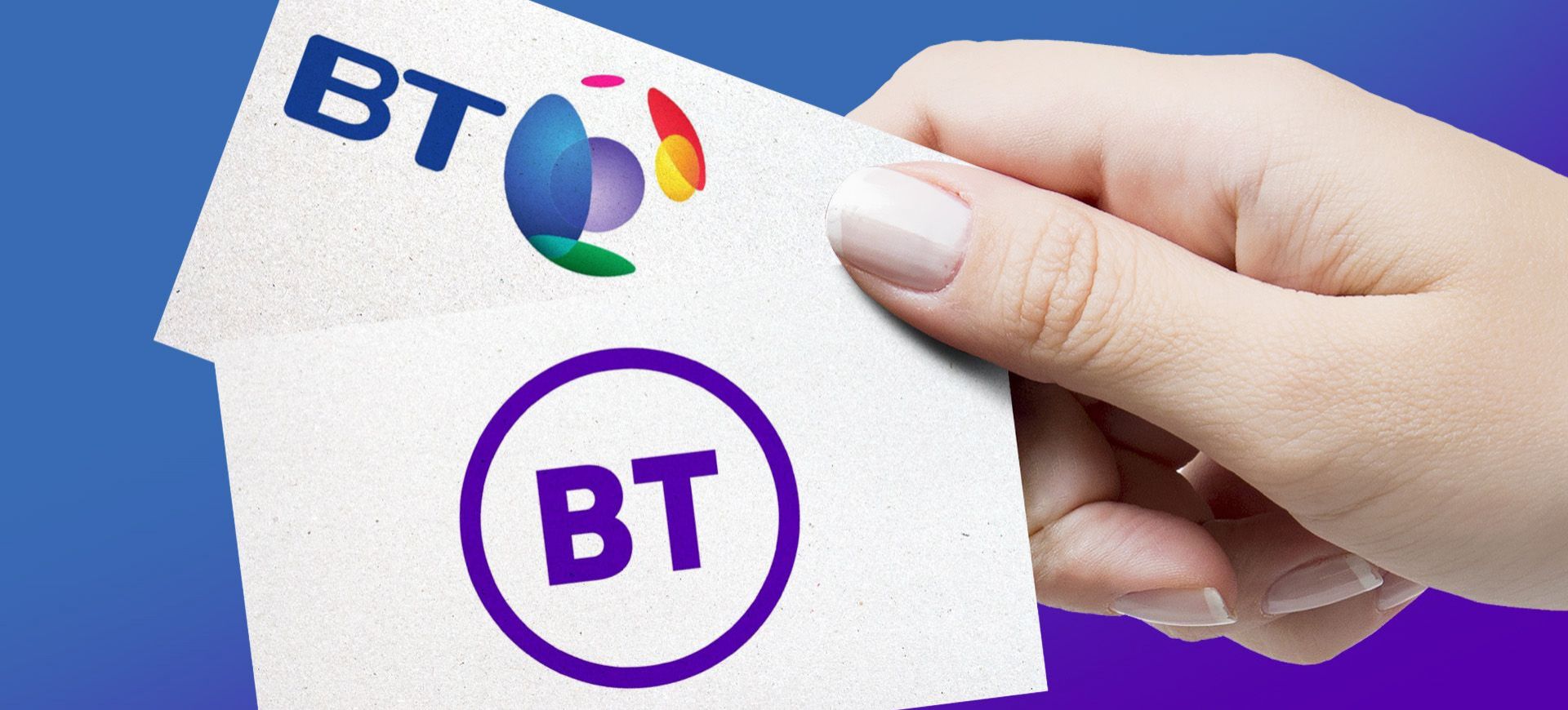
BT appear to be the latest to adopt the strategy having registered a trade mark for a simpler, flatter icon, moving away from the 3D 'globe' logo it currently uses. Looks like the new brand will launch next year.
Logos and marks optimised for viewing on a screen are the new norm. Take note.