For example red encourages appetite, evokes intensity, desire and urgency.2 No surprise then that Coca Cola, Kellogg's and McDonald's all have red logos. Now you're thinking "Which other brands are luring me in with their use of colour?". Well here are a few:
- Orange creates a call to action to buy, sell or subscribe. It's cheerful and confident. Here you'll find Amazon, Firefox, Harley Davidson.
- Green symbolises tranquility and is used to make you relax in shops as well as growth and health. Brands? Starbucks and Tropicana.
- Yellow increases cheerfulness, warmth, stimulates mental process, encourages communication, optimism and youthfulness. It grabs the attention. Here we have Ferrari, IKEA.
- Purple says creative, imaginative, wise and is used by Cadbury, Yahoo! and T-Mobile.
- Silver equals balance and sophistication. Apple and Mercedes didn't choose it by accident.
And before you think we're making this up, how about blue? Blue is non-invasive. We see it as a constant in human life and it increases our productivity. Blue is dependable. So what about all the social media networks you're a part of? What colour are their logos? Yep, you guessed it. Blue is ubiquitous, and as hard as you try to deny it, so is social media.
Coincidence that Facebook, Twitter, LinkedIn and Skype all have blue logos? We don't think so.
Now, at the risk of contradicting ourselves on the above, what about multi-coloured logos? Multiple colours show a consumer diversity and variety. Enter eBay, Google and Microsoft. And for our younger readers, the first time you created a school project using WordArt, and chose that multi-coloured arching text, you might just have been on to something.
OK, so that's all well and good but where's the hard evidence, we hear you cry!
- 84.7% of consumers cite colour as the primary reason for buying a product.
- Visual appearance accounts for 93% of buying behaviour.
- 80% believe colour increases recognition for brands.
- In the advertising game? Colour ads are read 42% more often than the same ad in black and white.
Works doesn't it?
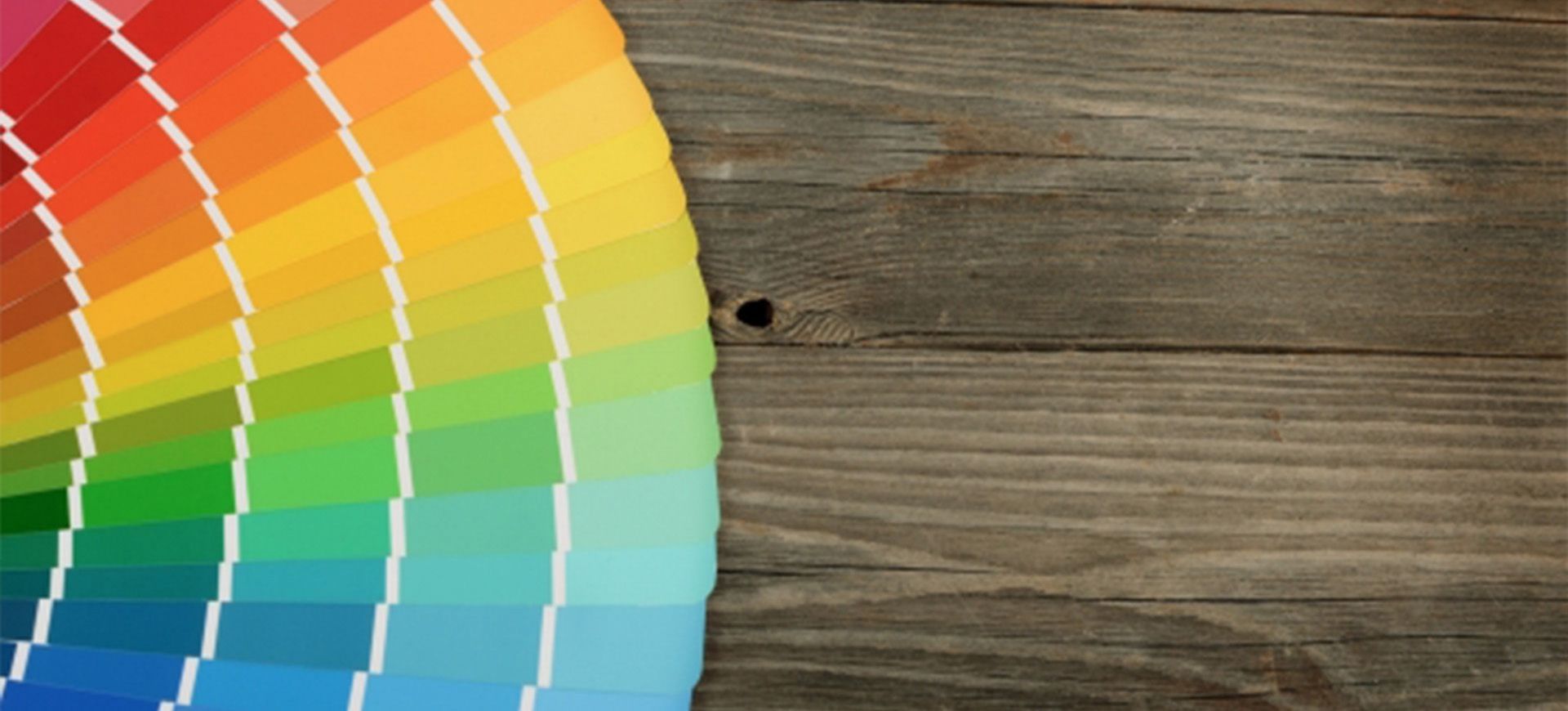
We always encourage our clients to think carefully when developing colour palettes and styles for their work. As we've seen, colour affects our perception of a brand before we even get to know it. So if you're considering a brand refresh, a new logo or a new colour palette for your brand, have a think about what you want businesses and consumers to think, or rather feel when they first see it.
- share
-

-

Back to Blogs