26th Mar 2018
26th Mar 2018
Here are 11 things we learnt from our visit.
1. The building itself is incredible. It's worth going just to take in the architecture, if nothing else.
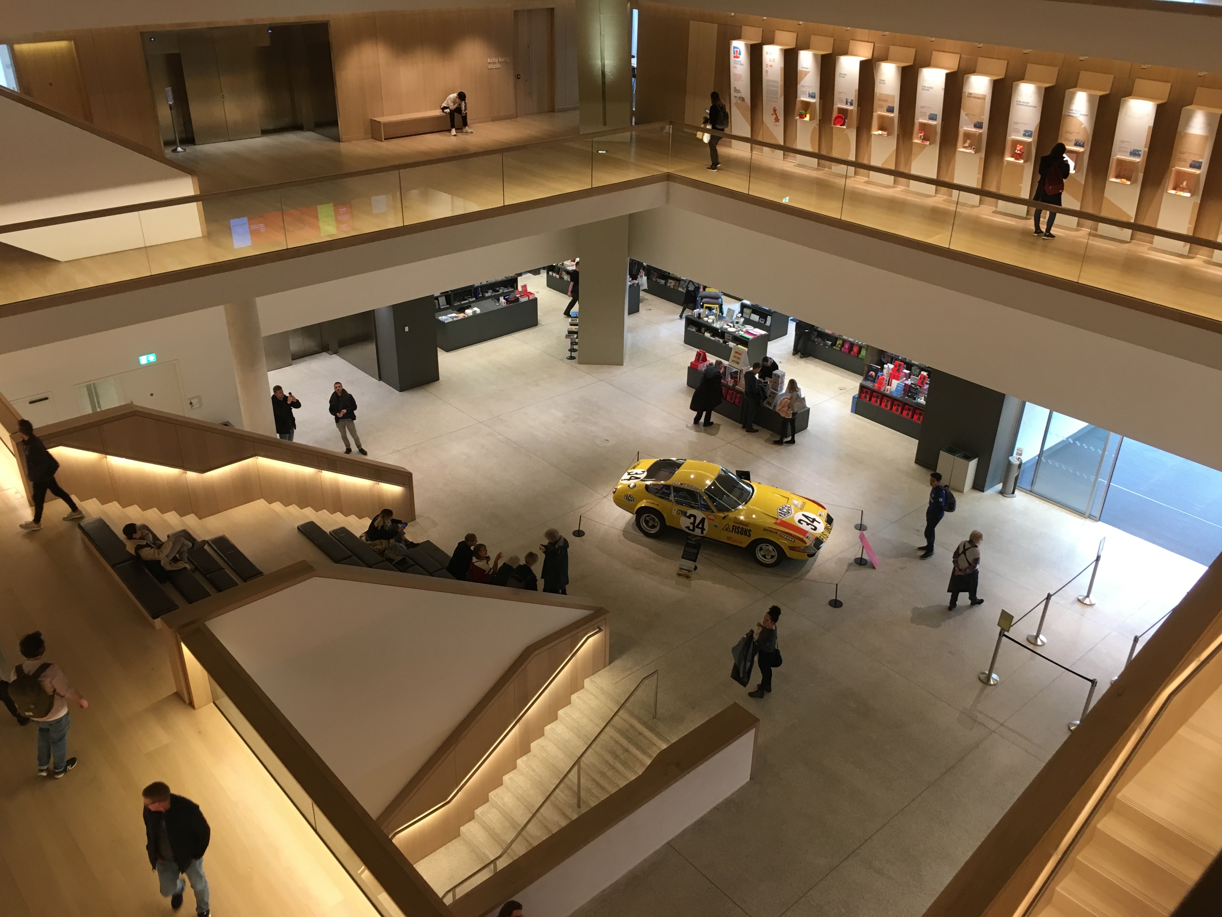
2. What immediately struck us about the revamped Design Museum is that it seems to be less of a museum in the traditional sense of the word and more of a showcase to iconic and original design. There are only a few exhibitions - which didn't make immediate sense to us. It's primarily devoted to encouraging creativity, with multiple rooms acting as libraries and areas to work and auditoriums for talks and workshops.
3. Designers in Residence demonstrates how the museum spurs on up-and-coming designers, giving them an area to further develop their designs and increase their potential. It demonstrates how the Museum follows the same principle of a conventional museum in terms of education but it's much more interactive in the sense that it felt almost community-built for prospective and established designers alike.
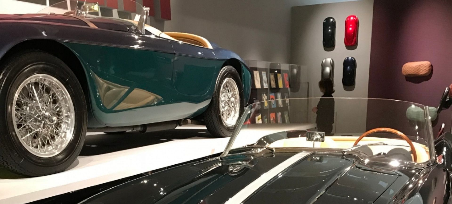
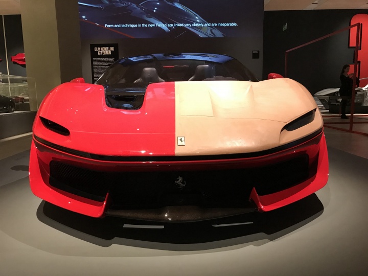
4. The Ferrari: Under the Skin exhibition is superb. It does help if you're into cars - specifically Ferraris, obviously - but even if you're not, you can stand back and just admire the craftsmanship, the design, the thought process, the attention to detail. We could go on.
5. The - unofficial exhibit title "A history of cool stuff" - showcasing iconic and, at the time, groundbreaking design pieces from the world of technology including first generation Walkmans, MiniDisc players (remember them?), ZX Spectrums (on which Ben learnt his trade), cathode ray tube televisions that Holly, being 22, had never seen before and a 128k Macintosh which the Apple fans amongst us were poring over.
6. It showed the more modern take on design and its place in the future, from the Guardian's new 'digital' look and reworked masthead to a working 3D printer creating bowls and chairs.
7. It wasn't just based on 'things', but displayed iconic design used for print - either for a political crusade or commercial purposes, for example The Zimbabwean's Trillion Dollar Campaign poster and the Olivetti typewriters adverts - complete polar opposites, but extremely eye-catching and effective.
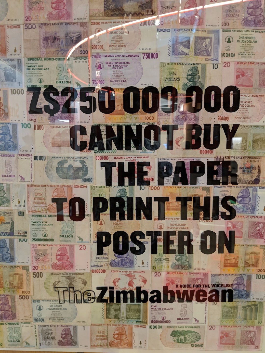
8. The Design Venture section showcases how the museum tries to inspire the younger generation, since the point of the competition is to encourage pupils in schools to think about designing and creating, whilst also educating them on business and transferable skills for when they join the adult world.
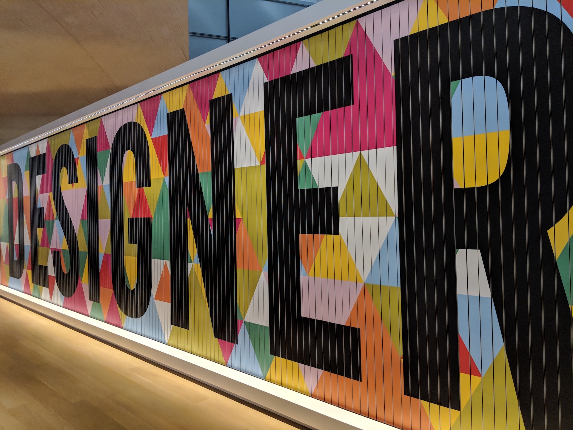
9. The most striking feature was the bold trivision mechanical billboard, alternating between the words 'Designer', 'Maker' and 'User'. Easily the first thing you see as you walk in, it emphasised the three phases of design, with 'Designer' being the thought-process, 'Maker' acting as the development of manufacturing and 'User' representing the relationship between the brand and the public.
10. Expanding on its community approach, the museum exhibited a wall with more than 200 objects, each nominated as someone's favourite thing - coffee press, Levi's, a mop, skateboard, those absolutely necessary Stan Smiths, Marmite, scissors, an umbrella, even an Ikea blue bag to name just a few.
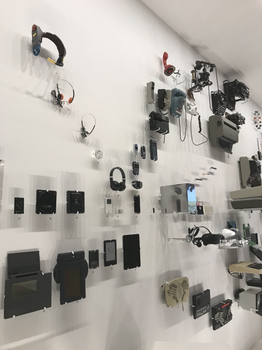
11. And lastly it showed the impact we have on design - there's a whole wall detailing the evolution of various forms of media and household objects with each item on display, from the first phone to the first typewriters to Apple's first generation iPod, etc. It was really interesting seeing how dramatically our growing needs shaped and changed the design of these objects (mainly making things smaller), just to make life easier for ourselves.
So if you like a bit of design, we would highly recommend the aptly named museum.
The Ferrari exhibition is only on until 15th April, so get there while you can. And they've got Gordon Ramsay's La Ferrari in there, so if you're a fan (or not as the case may be) you can see what shouting and swearing in television kitchens can buy you.
