Logo Colour Quiz
1. Hint: Wake up and smell the coffee?

Reveal answer
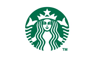
Starbucks was founded in 1971, but it didn't introduce the green colour palette until 1987 - to represent growth, freshness, uniqueness and prosperity. In 2011, to celebrate its 40th anniversary the logo underwent a dramatic change, resulting in a striking circular emblem featuring the 'siren' with no wordmark.
2. Hint: Going underground

Reveal answer
Subway is not only one of the fastest-growing franchises in the world, it is also the largest single-brand restaurant chain and the largest restaurant operator in the world.
The familiar yellow logo with arrowheads was first introduced in 1966 and has only undergone gentle evolution over the years to keep it up-to-date. The green and yellow colour combination was introduced from 2002.
3. Hint: The most visited website in the world

Reveal answer
The first Google logo was created in 1998 using multicolour 3D computerised letters and has undergone a lot of different colour iterations over the years. It uses primary colours, but doesn't have a uniform repeating pattern - this is deliberate - to signify the idea that Google doesn't follow predictable rules. In 2015, Google introduced a new logo designed to work cleanly across multiple devices and featuring clean flat versions of the colours that had previously had a 3D bevelled texture and drop shadows to them.
4. Hint: To the pub!

Reveal answer
The Heineken label as we know it today originates from at least 1883. It is recognised by its circular / oval shape, dominant green colour, five pointed red star and black horizontal bar. In 1954, Alfred Heineken wanted the label on his beer to portray a friendly feeling, so he had the capital letters replaced with rounded lowercase letters. The 'e' became the 'smiling e' using an intentional backward slant - a key design element still used on the label to this day.
5 Hint: A company that's bursting with energy.

Reveal answer
In the 1970's Red Bull was being marketed as an energy drink to shift workers in Thailand, such as farmers, construction workers and truck drivers, to overcome fatigue. It was packaged in a medicinal brown bottle with a brightly coloured label. An Austrian named Dietrich Mateschitz discovered the drink on a business trip when it 'cured' his jet lag. In partnership with the drink's inventor, they launched a modified version to suit european tastes. The bright colours remained as did the charging bulls from the label. The rest, as they say, is history!
6. Hint: Any colour so long as it's black
Reveal answer
The famous 'blue oval' was introduced by Ford Motor Co. In 1927 as the radiator badge on the release of the Model A. The question has often been asked whether the script of the brand name is based on Henry Ford's signature or handwriting, but the answer is no, it isn't. It was created by the company's first chief engineer/designer, Childe Harold Wills. Ford was looking for a logo for his vehicles, so Wills, a friend of Ford who designed and printed business cards, used the calligraphy from his own cards to stylize the letters.
7. Hint: A toy for all generations

Reveal answer
The LEGO logo we recognise today was first created in 1973, when LEGO were trying to standardise their brand for a global market, and had also just begun production in the United States. The square design echoes that of the product and is meant to showcase the variety of coloured blocks produced and be eye-catching to customers too. Despite a tweek in 1998 to make the colour outlines more visible, the logo remains unchanged to this day.
8. Hint: Delivered

Reveal answer
UPS has grown to become one of the biggest and most recognised parcel delivery companies in the world and one driving factor in that has to be the distinctive design and colour of their logo. The brown and gold logo really stands out in a world full of brightly coloured brands all fighting for attention. So why brown? The colour was trademarked in 1998 to stop other delivery companies using brown, but first came about in 1916, when Charlie Soderstrom joined the company. Founder James E Casey wanted to paint all the trucks yellow, however, Soderstrom pointed out they would be impossible to keep clean and instead suggested a brown shade similar to that used on the Pullman rail cars of the time. These rail cars conveyed class, refinement and professionalism - not to mention dirt was less obvious on the uniforms and vehicles. The decision was made and UPS have used brown ever since!
9. Hint: Jot it down

Reveal answer
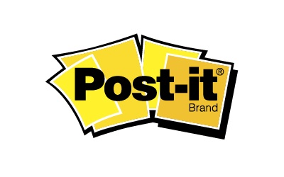
It is well known that a scientist at 3M, whilst attempting to develop a super-strong adhesive in 1968, accidently created a 'low-tack' reusable, pressure-sensitive adhesive which would go on to be used for the Post-it notes we know today. It wasn't until 1974, 6 years after this discovery, that the Post-it note truly came into being when a colleague came up with the idea of using the adhesive to anchor a bookmark in his hymn book. The rest, as they say, is history! But why the yellow colour of the note itself? Again this is purely by chance, the lab next door to the Post-it team only had scraps of yellow paper to use during development.
10. Hint: Assembly instructions

Reveal answer
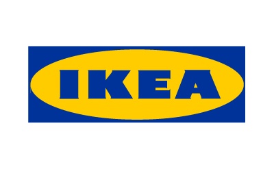
The IKEA name combines the initials of its founder Ingvar Kamprad, (IK) with the first letters from the names of both the farm and village where he grew up - Elmtaryd and Agunnaryd (EA). The logo itself has remained largely unchanged since its 1967 inclination, with the distinctive yellow and blue colouring added in 1983 to highlight the colours of the Swedish national flag. The blue represents trust, whilst the yellow depicts happiness, optimism and imagination.
11. Hint: Shopping list

Reveal answer
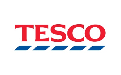
The Tesco brand first appeared in 1924 when Jack Cohen bought a shipment of tea from Thomas Edward Stockwell. He made a new label for it using the suppliers initials (TES) and the fist two letters from his surname (CO) to form the word TESCO. The current logo was first introduced in December 1995, with the familiar red dating back to the 1970 version of the logo. The Tesco logo borrows from the basic colours of the British flag, with the red representing prosperity and happiness and the blue depicting excellence and trustworthiness. Did you know a jaw-dropping 33% of retailers use the colour blue in their brand and 29% use red?
So how did you do?
If you enjoyed this - please share and try another of our quizzes - the marketing quiz or our Emoji brand quiz
Have a look at the psychology of colour and how to choose your brand colour or if you are thinking or redesigning your logo, see brand logo design.
(*Source: Colormatters.com)
- share
-

-

Back to Blogs